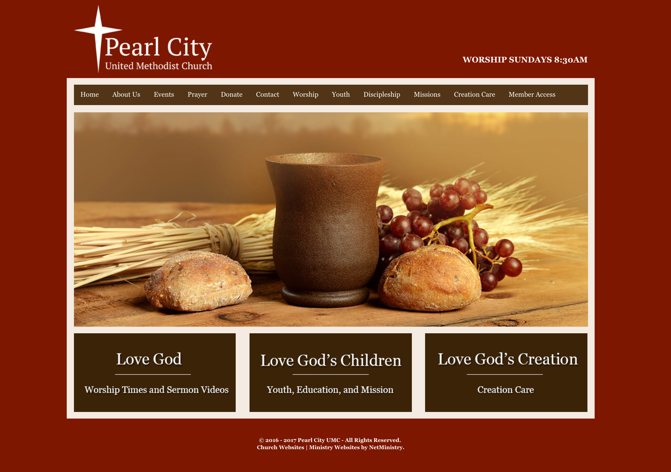
A logo and branding guide were created for the church when they were looking to update their printed materials as well as launch a brand new website. The logo incorporates the cross that hangs in the sanctuary of the church, the colors that reflect the building and stained glass windows, and the green direction the congregation wants to head in. The branding was then applied to the website direction and template, and was included in event promotions and printed pieces. The re-branding is a continuing process as new pieces are created and ministries are expanded.