Just like your choice of color is important finding the right font is crucial. Taking time to choose fonts carefully can give your branding and your messaging a certain feel or emotion. Picking a font can be hard. There are many options out there and different fonts can convey different feelings and emotions.
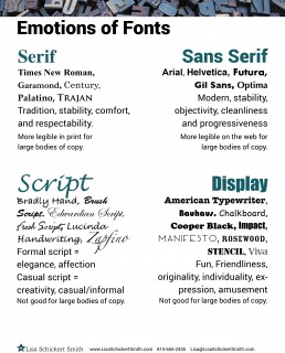
SERIF
Serif Fonts are fonts that have little “feet” on the end of the letters called serifs. Times New Roman is a serif font. Serif Fonts tend to be more legible in large bodies of copy in print, hence why most newspapers use serif fonts. Serif Fonts can convey tradition, comfort, and respectability.
SANS SERIF
Sans Serif Fonts are fonts that don’t have any “feet”. They have straight edges and little to no embellishments. Arial and Helvetica are sans serif fonts. Sans Serif Fonts are more legible on the web for large bodies of copy. Sans Serif Fonts portray modern, stability, objectivity, cleanliness and progressiveness.
SCRIPT
Script fonts are fonts that look like something that someone wrote, something a bit like cursive. They can be a bit more formal or have a handwritten feel to them. Many script fonts end with the word Script after them. An example of a script font is Edwardian Script and Lucinda Handwriting. Depending on the script font it can convey different things. A more formal script font can imply elegance, and affection. A more casual script font can convey creativity and a more casual approach.
DISPLAY
Display fonts are fonts that tend to have embellishments or different shapes. Basically anything that does not fit into one of the other categories is considered a display font. One main thing that distinguishes a display font from the other fonts is how it reads as a paragraph. Most display fonts do not work well as a paragraph. An example of a display font is Impact. Display fonts can convey fun, friendliness, originality, individuality, expression and amusement.
These are just 4 simple classifications of fonts. There are many more categories that they can be broken down into.
The rule of thumb is to use one or two fonts. Anything more than that gets distracting and can convey a message that you don’t know what you are doing.